Top Five White Paint Colours
Two of our most frequently asked questions are “What is your favourite white paint colour?” and “what is the best white paint colour for our home?”
Today I’m sharing 5 of our top favourite white paint colours for your walls, as well as a bonus tip at the end for some Pro Tips on how to get the perfect white paint colour for you!

Read to the end where I will also share one of our best design expert tips to getting the perfect white walls, it’s a game changer. You won’t want to miss it.
On that note, we’re all busy bees, so let’s get started!
Selecting the perfect white paint colour is such a unique experience for every home owner and renter. There are truly SO many options to choose from, and ‘we’ve all been there in the paint aisle wondering “how can there be SO many white paint options?”
That’s why I wanted to share 5 of our current favourite white paint colours, tried and tested on dozens of our projects.
Warmer and Cooler Tones
Let’s first talk about the traces of warmer and cooler undertones and how that will affect the feeling of your space. The Feeling, because that is such a big part of what we are going after when creating a space.
Warm tones will be cozier, smoother and dimensional but if we’re not careful, warmer can also read as dated, dirty and too yellow.
Cooler tones will be brighter, crisp and clean but if we’re not careful here it can read as cold, too modern and blue/green.
OK, for now let’s focus on what we came for - our top 5 whites!
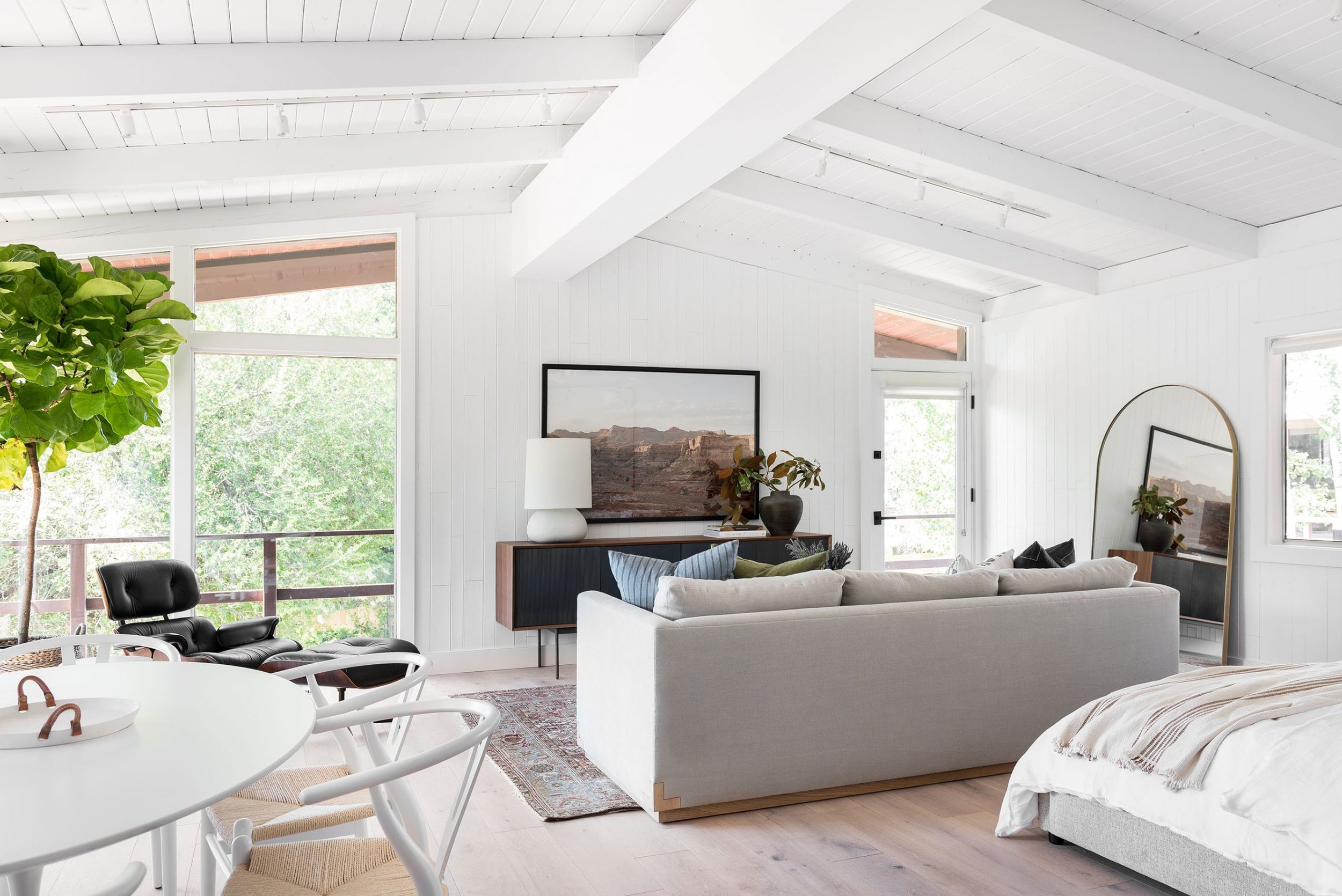
Benjamin Moore - Chantilly Lace OC-65
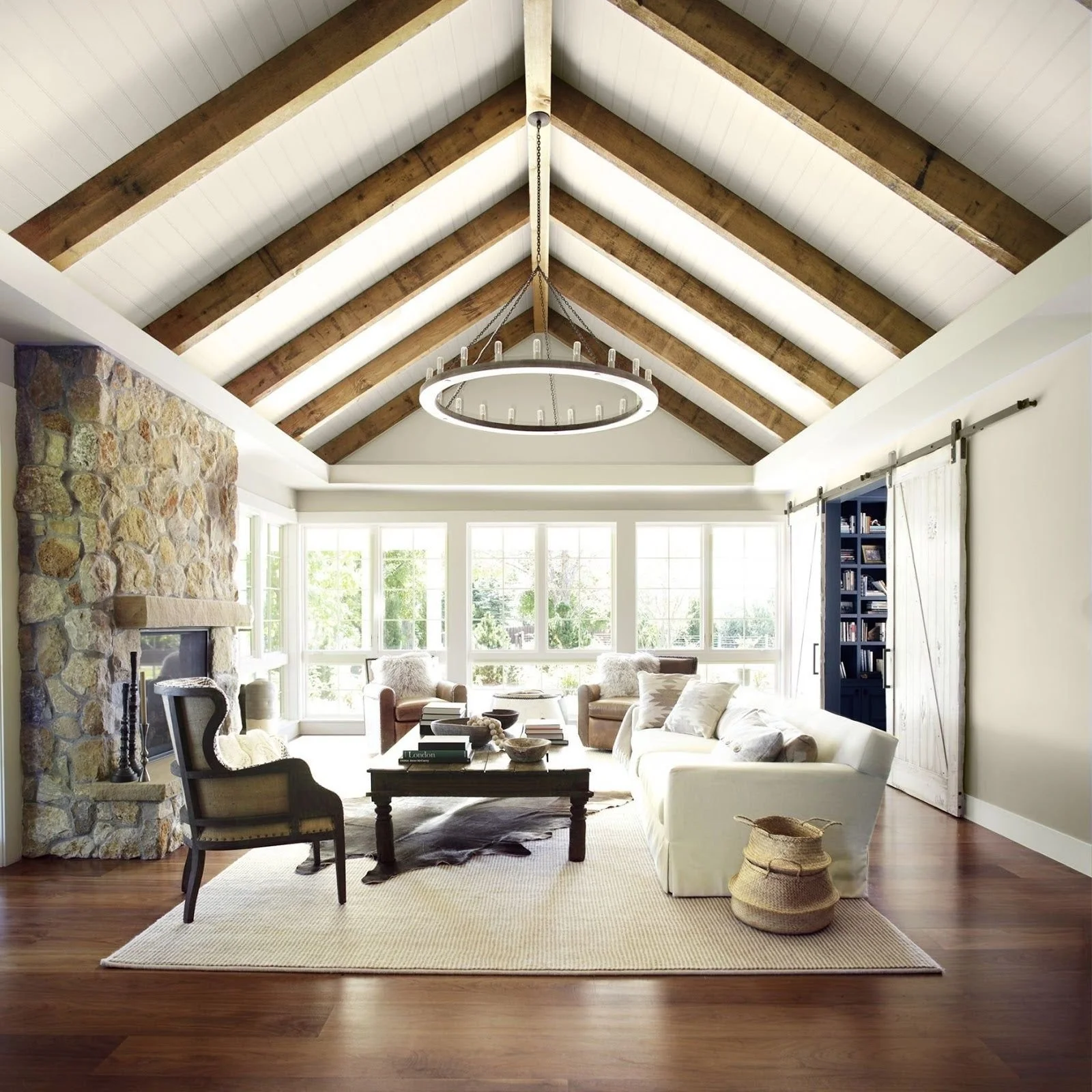
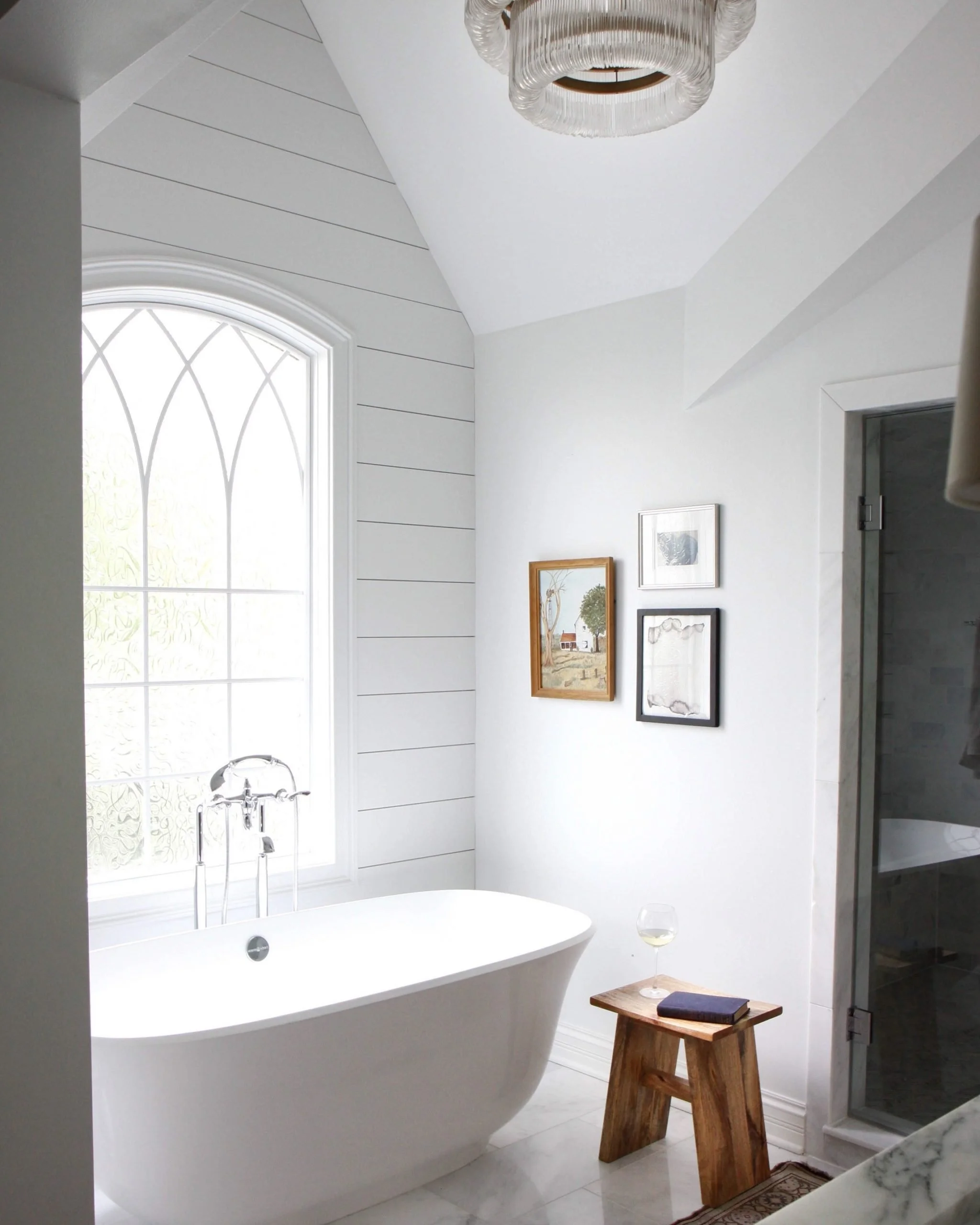
This is one our go to classics and absolute favourite whites, it reads very very bright and clean is one of Benjamin Moores cleanest whites. I love the descriptions of this colour because it emits feelings of cotton and silk, which are such pure natural materials and also really bright white. Chantilly Lace is perfect for walls, trim, ceiling and cabientry, if you are going for a really bright white.
The LRV levels are about 92 for Chantilly Lace, which means it’s about as pure of a white as you can get, as well as bright and crisp.
LRV - Light Reflectance Value
On top of this I wanted to quickly touch LRV (Light Reflectance Value). This is a topic I will absolutely be doing a different video and blog post on, but for the mean time, think about it as how much natural or artificial light your room gets, which will directly impact the colour selections. LRV refer to how light or dark a paint colour will look on scape of 0 (black) to 100 (white). The higher the LRV, the lighter the colour. The lower the LRV, the darker the colour is. You get the point. So think about the varying degrees of the paint colours and whites, and how without doing a sample on each of the walls, we won’t be able to measure the LRV or view the LRV with our own eyes.
Benjamin Moore - Simply White OC-117
This is a bright crisp white that has warm yellow undertones. It’s LRV rating is 91.7 which means it’s really white and bright. All that being said, this is a paint colour that I think needs some supervision, and put into spaces that are more updated and bright with LOTS of natural light. This might be the perfect place to do some tinting and in most cases we will tiny it to %75 and add in a %25 pure white so it eliminates any yellow undertones. We use this in spaces that have big windows and lots of natural light.
Studio McGee
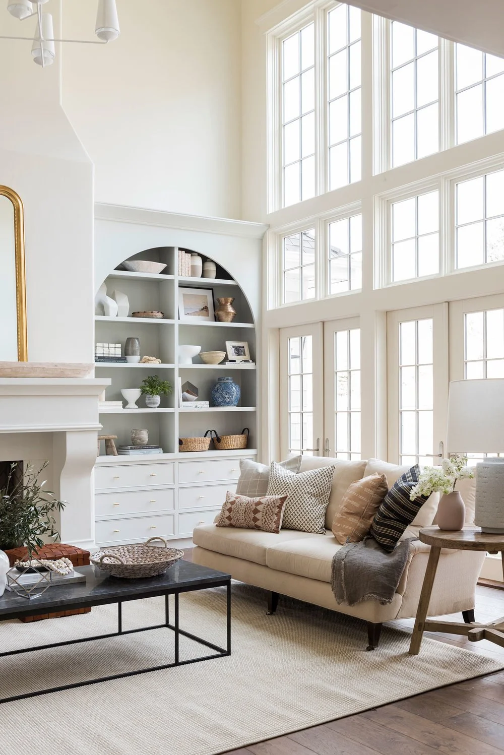
Benjamin Moore - Swiss Coffee OC-45
This Benjamin Moore paint colour is perfectly defined as warm, welcoming and smooth.
It pairs beautifully with wood tones and warm cabientry hardware. We love it in spaces that are more traditional and have lots of natural light, which can really make it feel brighter. We love how Shea McGee used it tinted at %75 all over in her own home to achieve a bright but warm feel.
What’s beautiful and unexpected in this white is that it is warmer in the yellow tones but also the green tones. Don’t be afraid of this word or undertone as it reads really natural and earthy, and its LRV is still super bright around 84.
Studio McGee
Paint Tinting
If tinted at %75 with a %25 pure white it can read even brighter and more unique. And that’s another element we love about creating spaces, we want options that are unique and reflect you. Using this ratio of the selected colour to pure white can help to offset the overpowering undertones of any paint colour and definitely worth a try!
Benjamin Moore - Pale Oak - OC-20
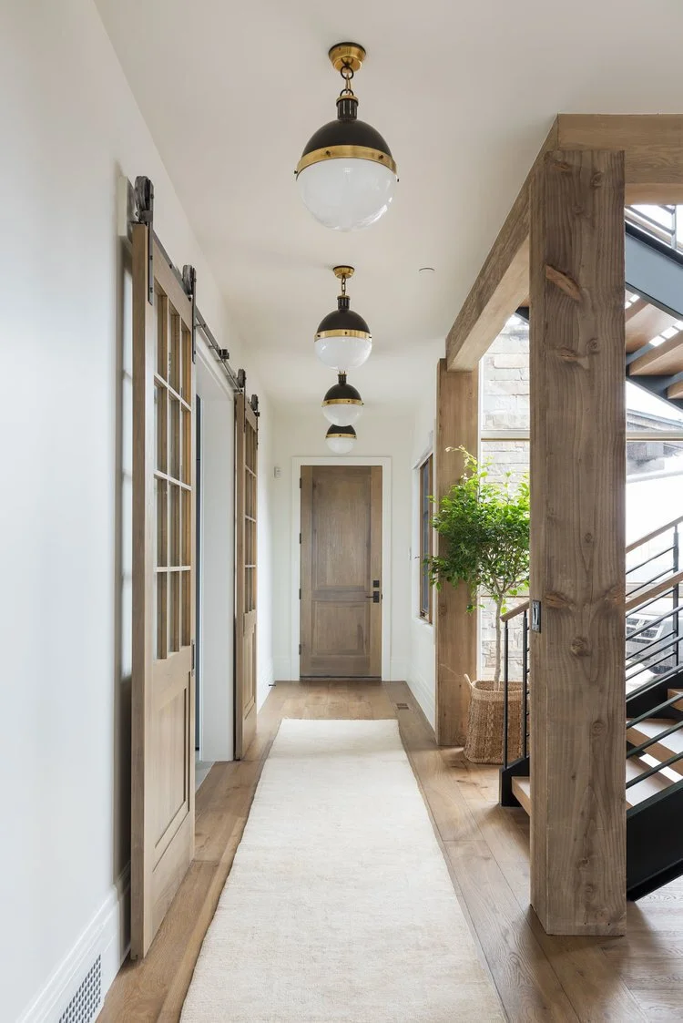
Ok, we’re not going to pretend this is a true white, but it has quickly become a white-alternatie lately. We’ve used this as a “greige” or neutral that pairs really well with both warm and cool tones. We are always looking for new neutrals and this is one of those colours that we love using as the perfect back drop to any space to add some depth and compliment the furniture and finishes in it. It pairs beautifully with Chantilly lace trim and ceiling for the perfect contrast of bright white.
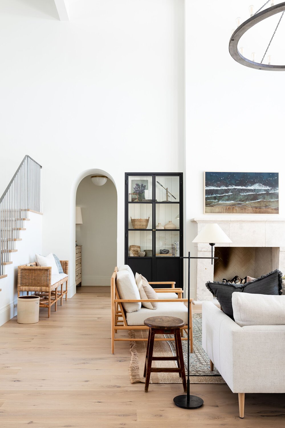
Benjamin Moore - White Dove OC-17
This is a classic and one that we absolutely love for trims, ceilings, moulding and cabinetry.
This white is a warmer white, and reads with beige and grey undertones for the perfect amount of depth. This is such a great white for spaces that are going for more depth, dimension and works so well in bright spaces as well as spaces with lower lighting. It pairs beautifully with Balboa Mist, also a warmer beige tone. And we love it with warm wood tones.
The LRV is about 85 which is a bright bright white.
Benjamin Moore - Super White OC-152
This is a cool shade of white and is described as a paint colour that suggests clarity and simplicity. This is a white that is so similar to Chantilly Lace, but offers more of a blue and gray under tone. It’s LRV is 89 which means it reads super bright and is great for clean, open, modern spaces or trim. I wouldn’t recommend this white for uneven walls as it can reveal imperfections, and again I would suggest doing a sample on each wall next to your other paint options.
This leads me into my next tip…
Creating samples:
Try HelloPaint.ca for paint samples. They are peel and stick and we use them on almost every single project. Otherwise, old school methods like purchasing a small paint sample will work as well!
Ordering a batch of your top selections will help to show all of the details we’ve talked about in this breakdown. Don’t be shy about ordering extras, who knows you might need them for your next step. Seeing these colours together is really going to help you put your space together beautifully.
Let’s recap:
Warmer whites vs cooler whites
Different Lighting Conditions (side note, areas with NO NATURAL light)
Test all the walls and look at all times of day
Trim and Ceiling
Consider the Intensity - you can mix the intensity of the actual colour with the PURE WHITE to give it a cleaner under tone
Samples (try HelloPaint.ca or purchase little paint samples!)
Be sure to check out our video on YouTube to see more details about our top 5 favourite white paint colours. Like and subscribe! Leave a comment as well, we would love to know your favourite white paint colours.